> For the complete documentation index, see [llms.txt](https://help.aranet.com/llms.txt). Markdown versions of documentation pages are available by appending `.md` to page URLs; this page is available as [Markdown](https://help.aranet.com/aranet-cloud-page/aranet-cloud-landing-page/user-interface-and-core-features/analytics/bar-chart.md).
# Bar Chart
New bar charts are available from the analytics page. Although they are currently in BETA.
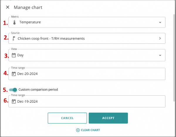
When managing the chart you will be greeted with this screen:
From here, you will choose the metric and the source of data for that metric, as well as other parameters.
1. Metric: choose the metric you want to view as a bar chart
2. Source of the data for that metric
3. Choose the DAY or MONTH to view the data by hour or by day
4. The time range for the bar chart
5. Enable or disable the comparison period, which allows you to compare two different days or months in the same chart of the same sensor.
6. The time range for the comparison
After choosing the specific parameters, you will see the bar chart itself:
This is really useful for something like an Energy meter to compare different months and see how the electricity usage changes month to month.
---
# Agent Instructions
This documentation is published with GitBook. GitBook is the documentation platform designed so that both humans and AI agents can read, navigate, and reason over technical content effectively. Learn more at gitbook.com.
## Querying This Documentation
If you need additional information that is not directly available in this page, you can query the documentation dynamically by asking a question.
Perform an HTTP GET request on the current page URL with the `ask` query parameter, and the optional `goal` query parameter:
```
GET https://help.aranet.com/aranet-cloud-page/aranet-cloud-landing-page/user-interface-and-core-features/analytics/bar-chart.md?ask=&goal=
```
`ask` is the immediate question: it should be specific, self-contained, and written in natural language.
`goal` is optional and describes the broader end goal you are ultimately trying to accomplish on behalf of the user. GitBook uses it to tailor the answer towards what is most useful for that goal.
The response will contain a direct answer to the question and relevant excerpts and sources from the documentation.
Use this mechanism when the answer is not explicitly present in the current page, you need clarification or additional context, or you want to retrieve related documentation sections.